
Color can describe the world, but it can also build a mood or structure a picture. A blue shadow may tell us about light; a blue face may tell us more about feeling or design. Artists have used that freedom in radically different ways.
Van Gogh used color and thick paint to animate familiar subjects. Matisse let brilliant areas of red and green organize an entire room. Kandinsky pushed color toward relationships that did not require a recognizable scene.
The effects are not fixed. A yellow field can feel expansive beside blue and sharp beside violet. Scale, texture, surrounding hues, and lighting all change perception. This is why a photograph of a painting can inform us while still missing much of the experience of standing before it.
Try looking at a painting first as a map of color. Where do hues repeat? Which area feels heavy or light? Then return to the subject. The two readings often reveal how the artist made an image hold together.
Color before the subject
Color relationships change with neighbors. A yellow beside violet can feel sharper than the same yellow beside cream, while a small dark patch can anchor a wide pale field. Painters exploit those effects without needing one fixed symbolic meaning for every hue.
Before naming a color’s mood, see how much space it occupies and what sits beside it. A thin red line can sharpen a field of green; a room flooded with red can change how every object within it reads. Paint has thickness and texture as well as hue, and a photograph can alter all three. The same named pigment will not look identical under every light. These physical relationships give a more reliable starting point than a fixed dictionary of emotional meanings.
More than symbolism
Monet used color to register light changing across a motif; Matisse allowed strong hues to build the architecture of a room; Mondrian reduced his palette to make proportion and balance newly apparent. The examples disagree about purpose, which is why color cannot be reduced to a mood chart.
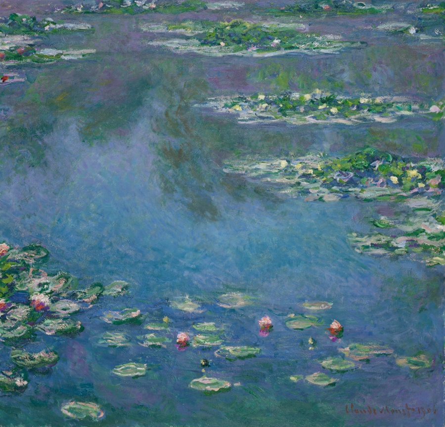
Matisse’s The Red Studio and Monet’s Water Lilies offer a useful contrast. The studio’s red spreads across furniture and walls, bringing separate things onto one surface. Monet’s pond lets small colored marks negotiate reflection and floating form. Try following one patch of color outward to its nearest neighbor in each painting. Does the next hue make it advance, recede, or change its role? The answer belongs to the arrangement, not to “red” or “blue” in isolation.
The surface and the light
A photograph or screen cannot perfectly reproduce an original surface. Pigment, paper, lighting, and display settings alter what viewers perceive. When a color surprises you in a museum, stay with it: ask whether it belongs to the depicted object, the light in the room, the artist’s design, or several of those at once.
Color is encountered through a material surface. Pigments change, varnish ages, and a screen can alter the balance between adjacent hues. These facts do not make a reproduction useless, but they caution against assigning a fixed emotional meaning to one sampled color. Look at placement and proportion instead. A narrow bright accent behaves differently from a broad field of the same hue, and a repeated color can carry the eye from one part of a painting to another.
Matisse beside Monet
Compare the reds of Matisse’s The Red Studio with a Monet view of the garden pond. In one, color seems to take over the architecture of an interior; in the other, colored marks can make reflection and vegetation difficult to separate. Neither use can be translated into a simple dictionary entry for “red” or “green.” The colors make relationships on a surface before they stand for abstract feelings.
In Matisse’s The Red Studio, red covers walls and furnishings that a viewer would ordinarily separate. In a Monet water-lily picture, color can make reflection and floating plants difficult to divide. Place the two images side by side and follow one hue across each surface. Does it describe an object, organize the room, or change your sense of depth? Returning to the whole work after that exercise shows why color cannot be translated into a simple list of moods.
Look at the relationships
Why painters return to hue as a subject in itself. When you return to the subject after this exercise, it may look newly organized. A vase becomes a weight of color; a reflected sky becomes a surface broken by leaves. The painting has not changed, but the path through it has. That shift explains why artists kept testing color as something they could compose with, rather than a final layer added after drawing. Follow the source image where available, and remember that the actual paint may hold differences a screen cannot preserve.